Drop-In style guide
This guide explains how to customize the Drop-in app.
The Reach Drop-In offers extensive visual customization, allowing you to modify colors, borders, and fonts to easily match your site's design.
Sample themes
Reach provides the following themes for the Drop-In app: Standard, Gray, Lavender, and Dark. Each theme has defined color palettes, border styles, and font settings. You can adapt a theme to comply wth your company's design requirements by leveraging the provided CSS variables. These sample themes provide a flexible starting point for customizing the Drop-In app on your checkout page.
You must also include the latest Reach badge and Terms of Service. Follow the instructions for adding the Reach badge and Terms of Service in the The Reach badge for custom checkouts .
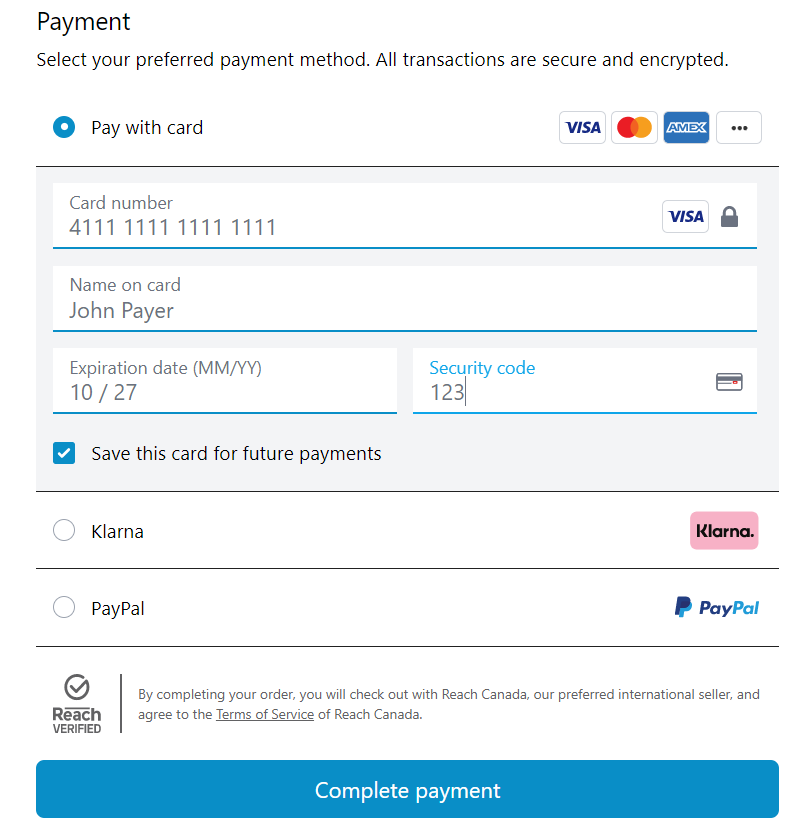
Standard
The Standard theme for the Reach Drop-In app provides a simple, clean user experience similar to many web applications. Its main color is vibrant blue, making the interface visually appealing. The image below shows the colors used in the Standard CSS.
Standard theme
{
        "--color-primary": "rgb(9, 142, 199)",

        "--accordion--border-color": "#212121",
        "--accordion--border-radius": "0",
        "--accordion--border-top-width": "0px",
        "--accordion--border-right-width": "0px",
        "--accordion--border-bottom-width": "1px",
        "--accordion--border-left-width": "0px",

        "--input--border-color": "rgb(9, 142, 199)",
        "--input--border-radius": "0",
        "--input--border-top-width": "0px",
        "--input--border-right-width": "0px",
        "--input--border-bottom-width": "2px",
        "--input--border-left-width": "0px"
}
Gray
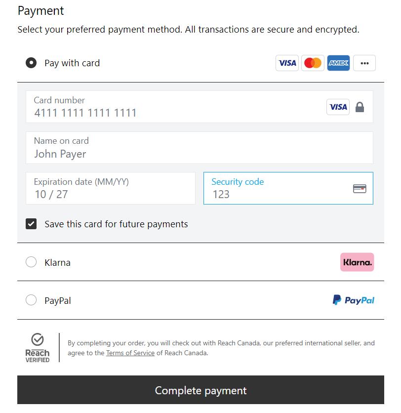
The Gray theme for the Reach Drop-In app provides a minimalist aesthetic for modern web applications. The following image shows an example of the Gray CSS.
Gray theme
{
        "--color-primary": "rgb(51, 51, 51)",

        "--accordion--border-color": "#212121",
        "--accordion--border-radius": 0,
        "--accordion--border-top-width": "0px",
        "--accordion--border-right-width": "0px",
        "--accordion--border-bottom-width": "1px",
        "--accordion--border-left-width": "0px",

        "--button--border-radius": 0,

        "--input--border-radius": 0
}
Lavender
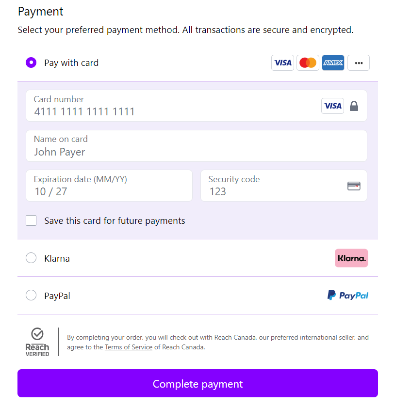
The Lavender theme for the Reach Drop-In app features a rich lavender hue and provides a vibrant yet calming aesthetic appropriate for modern web applications. The following image shows the colors associated with the Lavender CSS.
Lavender theme
{
        "--color-primary": "rgb(132, 0, 255)",
        "--color-hover": "#8447c3",
        "--color-content": "#f1edfb",

        "--accordion--border-color": "#d6baf3",
        "--accordion--border-radius": "0",
        "--accordion--border-top-width": "0px",
        "--accordion--border-right-width": "0px",
        "--accordion--border-bottom-width": "1px",
        "--accordion--border-left-width": "0px"
}
Dark
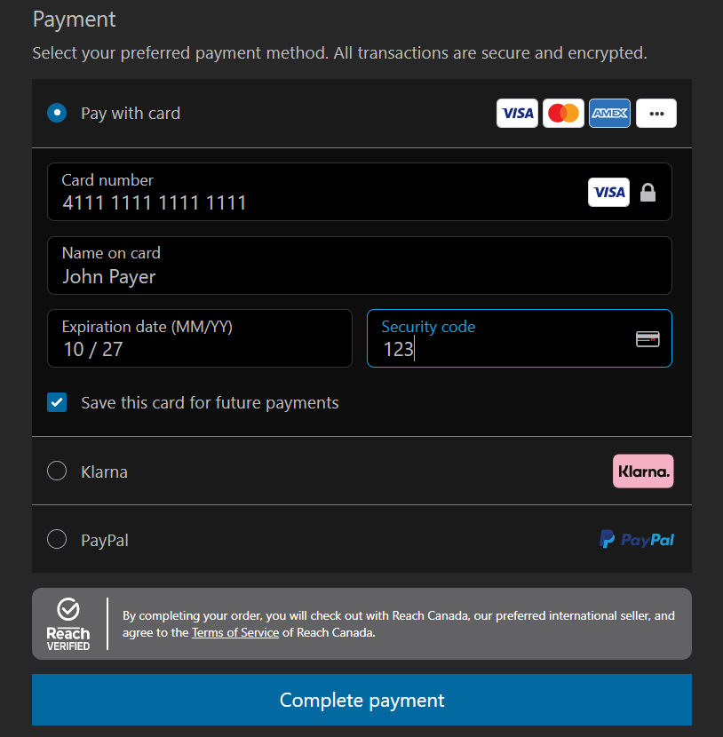
Developers can adapt the Dark theme to align with their application's branding. The following image shows the colors associated with the Dark CSS.
Dark theme
{
        "--font-color": "#bcbdbe",

        "--reach-badge--color": "dark",
        "--color-app": "#272727",

        "--color-header": "#1a1a1a",
        "--color-content": "#0d0d0d",

        "--accordion--border-color": "#7f7f7f",
        "--accordion--border-radius": 0,
        "--accordion--border-top-width": "0px",
        "--accordion--border-right-width": "0px",
        "--accordion--border-bottom-width": "0px",
        "--accordion--border-left-width": "0px",

        "--input--border-color": "#333333",
        "--input--font-color": "#bcbdbe",
        "--input--background-color": "black",

        "--button--border-radius": 0
}
The Complete payment button
By default, the Complete payment submit button resides within the Drop-In iframe and includes internal logic to determine when the shopper can submit payment.
Host your own submit payment button
Suppose you prefer to host your own external (outside the Drop-In iframe) button for submitting the payment. In that case, you can hide the iframe's internal submit button by using the hideSubmitButton flag, then control the button's turned on/off using the onSubmitEnabledChange.
RCH_CC.rchInit will return an object that you can use to call the submitPayment method. When called, this method invokes the same action as clicking the submit button internal to the iframe, allowing the parent page to have control over submitting the payment.
The submitPayment method will not perform additional checks to determine if payment can be sent; you should determine that before the request is sent.
External submit example
// reference button in dom
const btn = document.querySelector("#submit-btn");
btn.disabled = true;

// function will execute when the value changes. The value is the only parameter
const onSubmitEnabledChange = function (state) {
  btn.disabled = !state;
};

// initialize with the internal submit button hidden
const rchInstance = RCH_CC.rchInit({
  target,
  id,
  onSuccess,
  hideSubmitButton: true,
  onSubmitEnabledChange,
  locale: "en_US",
});

// assign click event listener
btn.addEventListener("click", () => {
  // call method on instance
  rchInstance.submitPayment();
});
Updated 4 months ago